
01
Start with the outcome.
Group related information and let spacing show the relationship.
Use this design system to make NASPA communications consistent, accessible, and easy to recognize across websites, presentations, reports, social media, and other formats. Each example is rendered as working HTML. Select View Source to inspect or copy the HTML and CSS.
Keep these choices consistent in every channel, even when the layout or scale changes.
Student Success
Use a clear hierarchy so readers can find the message, understand it, and act.
<link rel="stylesheet" href="/brand/tokens.css">

<style>
  .eyebrow { color:var(--naspa-green); font:var(--type-bold) 12px/1.2 var(--type-family); letter-spacing:.1em; text-transform:uppercase; }
  .headline { color:var(--naspa-navy); font:var(--type-extrabold) 32px/1.1 var(--type-family); margin:var(--spacing-8) 0; }
  .lead { color:var(--naspa-slate); font:var(--type-regular) 17px/1.55 var(--type-family); max-width:42ch; }
</style>
<section>
  <p class="eyebrow">Student Success</p>
  <h2 class="headline">Build belonging by design.</h2>
  <p class="lead">Use a clear hierarchy so readers can find the message, understand it, and act.</p>
</section>Primary
Supporting + accents
Neutrals
<link rel="stylesheet" href="/brand/tokens.css">

<style>
  .palette-group { margin-bottom:12px; }
  .palette-label { color:var(--naspa-navy); font:var(--type-bold) 11px var(--type-family); letter-spacing:.08em; text-transform:uppercase; }
  .palette { display:grid; grid-template-columns:repeat(3,1fr); min-height:72px; margin-top:6px; }
  .swatch { display:flex; align-items:end; padding:10px; color:var(--naspa-white); font:var(--type-bold) 11px var(--type-family); }
  .blue{background:var(--naspa-blue)}.green{background:var(--naspa-green)}.navy{background:var(--naspa-navy)}
  .cyan{background:var(--naspa-cyan);color:var(--naspa-navy)}.emerald{background:var(--naspa-emerald);color:var(--naspa-navy)}
  .mint{background:var(--naspa-mint);color:var(--naspa-navy)}
</style>
<div aria-label="NASPA color hierarchy">
  <div class="palette-group"><div class="palette-label">Primary</div><div class="palette"><div class="swatch blue">NASPA Blue var(--naspa-blue)</div><div class="swatch green">NASPA Green var(--naspa-green)</div></div></div>
  <div class="palette-group"><div class="palette-label">Supporting + accents</div><div class="palette"><div class="swatch navy">Navy var(--naspa-navy)</div><div class="swatch cyan">Cyan var(--naspa-cyan)</div><div class="swatch emerald">Emerald var(--naspa-emerald)</div><div class="swatch mint">Mint var(--naspa-mint)</div></div></div>
</div>Use only supplied shape artwork; keep it secondary to the message.
<link rel="stylesheet" href="/brand/tokens.css">

<style>
  .geometry-card { border:1px solid var(--naspa-mist); border-radius:var(--radius-square); padding:var(--spacing-24); }
  .approved-shapes { display:grid; grid-template-columns:72px 1fr; gap:var(--spacing-24); align-items:center; }
  .approved-shapes img, .approved-shapes svg { display:block; width:100%; height:auto; }
</style>
<article class="geometry-card">
  <div class="approved-shapes" aria-hidden="true">
    <img src="/assets/brand-elements/diamonds/diamond-naspa-blue.png" alt="">
    <svg viewBox="0 0 300 140"><polygon points="10,10 10,130 130,130" fill="var(--naspa-navy)"/><polygon points="50,12 250,12 150,112" fill="var(--naspa-blue)"/><polygon points="170,130 290,10 290,130" fill="var(--naspa-green)"/></svg>
  </div>
  <h3>Square by default</h3>
</article>Group related information and let spacing show the relationship.
<link rel="stylesheet" href="/brand/tokens.css">

<style>
  .feature { display:grid; grid-template-columns:64px 1fr; gap:20px; align-items:start; }
  .number { color:var(--naspa-blue); font:var(--type-extrabold) 44px/1 var(--type-family); border-top:4px solid var(--naspa-emerald); padding-top:10px; }
  .feature h3 { color:var(--naspa-navy); font:var(--type-extrabold) 24px/1.2 var(--type-family); margin:0 0 var(--spacing-8); }
  .feature p { color:var(--naspa-slate); font:var(--type-regular) 15px/1.6 var(--type-family); margin:0; max-width:45ch; }
</style>
<article class="feature">
  <div class="number">01</div>
  <div><h3>Start with the outcome.</h3><p>Group related information and let spacing show the relationship.</p></div>
</article>Use these examples when making common design decisions. Each one explains what to protect and what to avoid.
Place the full NASPA logo first and keep the partner logo optically balanced. Preserve the NASPA “S” clear space around the logo. Between each logo and the divider, leave space equal to the width of the “N” in NASPA.
Approval: Submit every proposed co-branded lockup through the MarComm request form before publication.
Light background

Example only. Keep clear space equal to the width of the “N” in NASPA on both sides of the divider, and preserve both organizations’ other clear-space requirements.
Dark background

Example only. Keep clear space equal to the width of the “N” in NASPA on both sides of the divider, and preserve both organizations’ other clear-space requirements.
<link rel="stylesheet" href="/brand/tokens.css">

<style>
  .co-brand { --naspa-n-space:28px; display:flex; align-items:center; justify-content:center; padding:var(--spacing-24); }
  .co-brand.dark { background:var(--naspa-navy); color:var(--naspa-white); }
  .co-brand img { width:170px; height:58px; object-fit:contain; }
  .divider { width:1px; height:58px; margin-inline:var(--naspa-n-space); background:currentColor; opacity:.4; }
  .partner { min-width:120px; text-align:center; font:var(--type-bold) 16px/1.2 var(--type-family); text-transform:uppercase; }
</style>
<div class="co-brand">
  <img src="/assets/logos/primary/NASPA_MAIN.png" alt="NASPA">
  <span class="divider" aria-hidden="true"></span>
  <span class="partner" aria-label="Approved partner logo">Partner Logo</span>
</div>Start with approved high-contrast pairs. Check contrast whenever text size, weight, opacity, or background changes; never treat a palette color as automatically accessible in every combination.
Accessibility note: Body text should meet at least WCAG 2.2 AA contrast. Labels and icons must not rely on color alone.
<link rel="stylesheet" href="/brand/tokens.css">

<style>
  .pair-grid { display:grid; grid-template-columns:repeat(2,1fr); gap:10px; }
  .pair { min-height:92px; padding:var(--spacing-16); display:flex; flex-direction:column; justify-content:space-between; font-family:var(--type-family); }
  .pair strong { font-size:18px; }.pair span { font-size:12px; font-weight:var(--type-bold); }
</style>
<div class="pair-grid">
  <div class="pair" style="background:var(--naspa-navy);color:var(--naspa-white)"><strong>Navy + White</strong><span>Approved</span></div>
  <div class="pair" style="background:var(--naspa-white);color:var(--naspa-green);border:1px solid var(--naspa-mist)"><strong>White + NASPA Green</strong><span>Approved</span></div>
  <div class="pair" style="background:var(--naspa-mint);color:var(--naspa-navy)"><strong>Mint + Navy</strong><span>Approved</span></div>
  <div class="pair" style="background:var(--naspa-blue);color:var(--naspa-white)"><strong>NASPA Blue + White</strong><span>Approved</span></div>
</div>Crosshatch, lines, diamond grid, and diamond dots are background treatments. Keep them secondary to the message and protect text legibility. Use approved diamond and triangle artwork separately from these background patterns.
DoUse one background treatment at a time.
Don’tPlace detailed patterns behind long text or combine several graphic elements in one small area.
<link rel="stylesheet" href="/brand/tokens.css">

<style>
  .backgrounds { display:grid; grid-template-columns:repeat(2,1fr); gap:10px; }
  .sample { min-height:110px; position:relative; display:flex; align-items:end; padding:12px; color:var(--naspa-white); background-color:var(--naspa-navy); overflow:hidden; }
  .lines { background-image:repeating-linear-gradient(135deg,transparent 0 12px,color-mix(in srgb, var(--naspa-white) 18%, transparent) 12px 14px); }
  .dots { background-image:radial-gradient(color-mix(in srgb, var(--naspa-white) 35%, transparent) 1.5px,transparent 1.5px); background-size:16px 16px; }
</style>
<div class="backgrounds">
  <div class="sample lines"><strong>Lines background</strong></div>
  <div class="sample dots"><strong>Diamond dots background</strong></div>
</div>Use square corners, one-pixel neutral borders, and spacing increments that create a clear reading rhythm. If a platform prevents square corners, use the smallest available radius up to 5px.
Keep related items closer together and separate new ideas with more space. Avoid decorative shadows and large pill-shaped containers.
24px internal spacing
Only when required
<link rel="stylesheet" href="/brand/tokens.css">

<style>
  .cards { display:grid; grid-template-columns:repeat(2,1fr); gap:var(--spacing-16); }
  .card { border:1px solid var(--naspa-mist); border-radius:var(--radius-square); padding:var(--spacing-24); }
  .fallback { border-radius:var(--radius-fallback); }
  .card h3 { margin:0 0 var(--spacing-8); color:var(--naspa-navy); }.card p { margin:0; color:var(--naspa-slate); }
</style>
<div class="cards">
  <article class="card"><h3>Square standard</h3><p>24px internal spacing</p></article>
  <article class="card fallback"><h3>5px fallback</h3><p>Only when required</p></article>
</div>Use Navy with White text for the primary action and NASPA Blue on hover. Use a quieter secondary action and descriptive text links. Every control needs visible hover and keyboard-focus states. Keep Emerald for accents, not White-text buttons.
Pair status colors with text and icons. Disabled controls must remain readable and should only be used when the user can understand how to enable them.
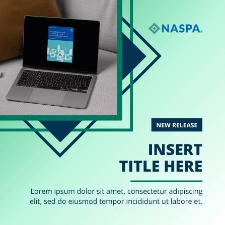
Choose one clear focal point, protect safe margins, and review the final design at mobile size. Crop intentionally; do not place essential faces, logos, or text against likely cropping edges.
Accessibility note: Provide useful alternative text for informative images. Use empty alt text for decorative images, and include captions or transcripts for time-based media.
<link rel="stylesheet" href="/brand/tokens.css">
<link rel="stylesheet" href="/brand/portal-ui.css">

<style>
  .callout { border-left:6px solid var(--naspa-cyan); background:var(--ui-legacy-e8f7fe); padding:var(--spacing-16); color:var(--naspa-navy); }
  .callout.tip { border-color:var(--naspa-emerald); background:var(--ui-legacy-eaf7f3); }
  .callout.warning { border-color:var(--ui-legacy-f7a505); background:var(--ui-legacy-fff7e6); }
  .callout h3 { font:var(--type-bold) 15px var(--type-family); margin:0 0 5px; }
  .callout p { font:var(--type-regular) 14px/1.5 var(--type-family); margin:0; }
</style>
<aside class="callout" role="note"><h3>Note</h3><p>Use this pattern for helpful context that supports the main task.</p></aside>Find upcoming learning opportunities.
Browse practical tools and guidance.
Connect with communities of practice.
Recognize work and contributions.
<link rel="stylesheet" href="/brand/tokens.css">

<style>
  .features { display:grid; grid-template-columns:repeat(4,1fr); gap:12px; }
  .feature-card { border:1px solid var(--naspa-mist); border-left:6px solid var(--naspa-blue); padding:var(--spacing-16); }
  .feature-card h3 { color:var(--naspa-navy); font:var(--type-bold) 15px var(--type-family); margin:0 0 var(--spacing-8); }
  .feature-card p { color:var(--naspa-slate); font:var(--type-regular) 12px/1.5 var(--type-family); margin:0; }
  @media(max-width:700px){.features{grid-template-columns:repeat(2,1fr)}}
</style>
<div class="features">
  <article class="feature-card"><h3>Events</h3><p>Find upcoming learning opportunities.</p></article>
  <article class="feature-card"><h3>Resources</h3><p>Browse practical tools and guidance.</p></article>
  <article class="feature-card"><h3>Networks</h3><p>Connect with communities of practice.</p></article>
  <article class="feature-card"><h3>Awards</h3><p>Recognize work and contributions.</p></article>
</div>Give readers the essential context before asking them to choose a path.
Use a second panel when the content is useful but not needed by everyone.
State what happens next and use one primary action.
<link rel="stylesheet" href="/brand/tokens.css">
<link rel="stylesheet" href="/brand/portal-ui.css">

<style>
  [role="tablist"] { display:flex; gap:4px; }
  [role="tab"] { border:2px solid transparent; border-radius:var(--radius-square); background:var(--naspa-navy); color:var(--naspa-white); padding:10px var(--spacing-16); font-weight:var(--type-bold); }
  [role="tab"][aria-selected="true"] { background:var(--naspa-blue); }
  [role="tabpanel"] { border:1px solid var(--ui-legacy-c9d4de); padding:20px; }
</style>
<div role="tablist" aria-label="Sample information sections">
  <button id="tab-1" role="tab" aria-selected="true" aria-controls="panel-1">Overview</button>
  <button id="tab-2" role="tab" aria-selected="false" aria-controls="panel-2" tabindex="-1">Details</button>
  <button id="tab-3" role="tab" aria-selected="false" aria-controls="panel-3" tabindex="-1">Next steps</button>
</div>
<section id="panel-1" role="tabpanel" aria-labelledby="tab-1"><h3>Start with the main point</h3><p>Give readers the essential context first.</p></section>
<script>
  // On click or Arrow Left/Right, update aria-selected and tabindex,
  // move focus to the active tab, and show its matching panel.
</script><link rel="stylesheet" href="/brand/tokens.css">
<link rel="stylesheet" href="/brand/portal-ui.css">
<style>
.accordion { border:1px solid var(--ui-legacy-c9d4de); }
.accordion button { width:100%; border:0; border-radius:var(--radius-square); background:var(--naspa-blue); color:var(--naspa-white); padding:12px var(--spacing-16); text-align:left; font-weight:var(--type-bold); }
.accordion-panel { padding:var(--spacing-16); color:var(--naspa-slate); }
</style>
<div class="accordion">
<section>
<h3><button aria-expanded="true" aria-controls="answer-1">Who may use this template?</button></h3>
<div id="answer-1" class="accordion-panel">NASPA staff and approved partners may use it for authorized communications.</div>
</section>
<section>
<h3><button aria-expanded="false" aria-controls="answer-2">What may I change?</button></h3>
<div id="answer-2" class="accordion-panel" hidden>Update the message and approved imagery. Keep brand elements intact.</div>
</section>
</div>
<script>
document.querySelectorAll('.accordion button').forEach(function (button) {
button.addEventListener('click', function () {
var panel = document.getElementById(button.getAttribute('aria-controls'));
var open = button.getAttribute('aria-expanded') === 'true';
button.setAttribute('aria-expanded', String(!open));
panel.hidden = open;
});
});
</script>Start with these patterns instead of rebuilding common layouts from scratch.
Use section labels, lead paragraphs, pull quotes, statistics, captions, and attribution to make reports and articles easier to scan.
“Sample quotation text can highlight one idea without interrupting the page.”
<link rel="stylesheet" href="/brand/tokens.css">

<style>
  .quote { border-left:5px solid var(--naspa-cyan); padding:6px 0 6px 20px; }
  .quote blockquote { color:var(--naspa-navy); font:var(--type-bold) 22px/1.35 var(--type-family); margin:0 0 10px; }
  .quote cite { color:var(--naspa-slate); font:var(--type-semibold) 13px var(--type-family); font-style:normal; }
</style>
<figure class="quote">
  <blockquote>“Sample quotation text can highlight one idea without interrupting the page.”</blockquote>
  <cite>Sample attribution</cite>
</figure>Use familiar structures - section openers, accent banners, columns, cards, sidebars, and report tables - so readers know where to look next.
Annual Report
Lead with the most important message.
Add context without competing.
<link rel="stylesheet" href="/brand/tokens.css">

<style>
  .layout { border:1px solid var(--naspa-mist); }
  .banner { background:var(--naspa-navy); color:var(--naspa-white); padding:20px; border-bottom:6px solid var(--naspa-emerald); }
  .columns { display:grid; grid-template-columns:1fr 1fr; gap:var(--spacing-16); padding:20px; }
  .columns article { border-top:4px solid var(--naspa-blue); padding-top:12px; }
</style>
<section class="layout">
  <header class="banner"><h2>Section opener</h2></header>
  <div class="columns"><article>Primary idea</article><article>Supporting idea</article></div>
</section>Use descriptive links, clear buttons, accessible alerts, labeled forms, breadcrumbs, pagination, and consistent resource cards.
<link rel="stylesheet" href="/brand/tokens.css">
<link rel="stylesheet" href="/brand/portal-ui.css">

<style>
  .notice { border-left:5px solid var(--naspa-cyan); background:var(--ui-legacy-e8f7fe); padding:14px; color:var(--naspa-navy); }
  .field { display:block; margin-top:var(--spacing-16); color:var(--naspa-navy); font:var(--type-bold) 13px var(--type-family); }
  .field input { box-sizing:border-box; width:100%; margin-top:6px; border:1px solid var(--naspa-slate); padding:10px; font:var(--type-regular) 15px var(--type-family); }
  .action { margin-top:14px; border:0; border-radius:var(--radius-square); background:var(--naspa-navy); color:var(--naspa-white); padding:10px var(--spacing-16); font-weight:var(--type-bold); }
  .action:hover { background:var(--naspa-blue); }
  .action::after { content:"›"; margin-left:12px; font-size:18px; }
</style>
<div class="notice" role="status"><strong>Application saved.</strong> You can return before the deadline.</div>
<label class="field">Email address<input type="email" autocomplete="email"></label>
<button class="action" type="button">Continue application</button>Use clear titles, direct labels, units, enough contrast, source notes, and a plain-language takeaway. Avoid 3D effects and differences shown by color alone.
Takeaway: Apples received the most selections.
Mock data for layout demonstration. This data is not affiliated with NASPA’s Research.
<link rel="stylesheet" href="/brand/tokens.css">

<style>
  .chart-row { display:grid; grid-template-columns:90px 1fr 44px; gap:10px; align-items:center; margin:12px 0; }
  .track { height:22px; background:var(--naspa-mist); }
  .bar { height:100%; background:var(--naspa-blue); }
  .bar.green { background:var(--naspa-green); }
</style>
<figure aria-labelledby="chart-title">
  <figcaption id="chart-title"><strong>Favorite fruit in a fictional class</strong><br>Mock data · share of 18 responses</figcaption>
  <div class="chart-row"><span>Apples</span><div class="track"><div class="bar" style="width:50%"></div></div><strong>50%</strong></div>
  <div class="chart-row"><span>Bananas</span><div class="track"><div class="bar green" style="width:33%"></div></div><strong>33%</strong></div>
  <p>Takeaway: Apples received the most selections. Mock data only - not NASPA research.</p>
</figure>Takeaway: The fictional class read more books each week.
Mock data for layout demonstration. This data is not affiliated with NASPA’s Research.
<link rel="stylesheet" href="/brand/tokens.css">

<figure aria-labelledby="trend-title">
  <figcaption id="trend-title"><strong>Books read during four imaginary weeks</strong><br>Mock classroom data</figcaption>
  <svg viewBox="0 0 520 220" role="img" aria-labelledby="svg-title svg-desc">
    <title id="svg-title">Books read increased from 8 to 18</title>
    <desc id="svg-desc">Four points show 8 books in week 1, 11 in week 2, 14 in week 3, and 18 in week 4.</desc>
    <polyline points="50,165 190,132 330,82 470,34" fill="none" stroke="var(--naspa-blue)" stroke-width="5"/>
    <g fill="var(--naspa-green)" stroke="white" stroke-width="4">
      <circle cx="50" cy="165" r="8"/><circle cx="190" cy="132" r="8"/>
      <circle cx="330" cy="82" r="8"/><circle cx="470" cy="34" r="8"/>
    </g>
  </svg>
  <p><strong>Takeaway:</strong> The fictional class read more books each week. Mock data only.</p>
</figure>Use a proportion chart only when the categories make up one meaningful whole and add to 100%. Limit the number of segments so the message remains clear.
Accessibility note: The chart is decorative; the adjacent labels and values carry the information without relying on color.
Takeaway: Tag represents nearly half of the mock responses.
Mock data for layout demonstration. This data is not affiliated with NASPA’s Research.
<link rel="stylesheet" href="/brand/tokens.css">
<link rel="stylesheet" href="/brand/portal-ui.css">

<style>
  .proportion { display:grid; grid-template-columns:180px 1fr; gap:var(--spacing-24); align-items:center; }
  .donut { width:180px; aspect-ratio:1; border-radius:var(--ui-shape-round); background:conic-gradient(var(--naspa-blue) 0 48%,var(--naspa-green) 48% 80%,var(--naspa-cyan) 80%); position:relative; }
  .donut::after { content:"48%"; position:absolute; inset:32%; display:grid; place-items:center; border-radius:var(--ui-shape-round); background:var(--naspa-white); color:var(--naspa-navy); font:var(--type-extrabold) 24px var(--type-family); }
  .legend { list-style:none; padding:0; }.legend li { display:grid; grid-template-columns:12px 1fr auto; gap:var(--spacing-8); margin:10px 0; }
</style>
<figure>
  <figcaption><strong>Favorite playground activities in a fictional class</strong></figcaption>
  <div class="proportion">
    <div class="donut" aria-hidden="true"></div>
    <ul class="legend" aria-label="Playground activity shares">
      <li><span></span><span>Tag</span><strong>48%</strong></li>
      <li><span></span><span>Chalk drawing</span><strong>32%</strong></li>
      <li><span></span><span>Jump rope</span><strong>20%</strong></li>
    </ul>
  </div>
  <p>Mock data only - not NASPA research.</p>
</figure>| Item | Starting | Sold | Remaining |
|---|---|---|---|
| Cupcakes | 24 | 18 | 6 |
| Cookies | 36 | 27 | 9 |
| Brownies | 18 | 12 | 6 |
Mock data for layout demonstration. This data is not affiliated with NASPA’s Research.
<link rel="stylesheet" href="/brand/tokens.css">
<link rel="stylesheet" href="/brand/portal-ui.css">

<style>
  .table-wrap { overflow-x:auto; }
  table { width:100%; min-width:520px; border-collapse:collapse; font:var(--type-regular) 14px/1.4 var(--type-family); }
  caption { margin-bottom:12px; text-align:left; color:var(--naspa-navy); font-size:18px; font-weight:var(--type-bold); }
  th,td { border:1px solid var(--ui-legacy-d9e1e8); padding:12px var(--spacing-16); text-align:left; }
  thead { background:var(--naspa-navy); color:var(--naspa-white); }
  tbody tr:nth-child(even) { background:var(--ui-legacy-f6f8fa); }
</style>
<div class="table-wrap" role="region" aria-labelledby="results-caption" tabindex="0">
  <table>
    <caption id="results-caption">Mock bake sale inventory</caption>
    <thead><tr><th scope="col">Item</th><th scope="col">Starting</th><th scope="col">Sold</th><th scope="col">Remaining</th></tr></thead>
    <tbody>
      <tr><th scope="row">Cupcakes</th><td>24</td><td>18</td><td>6</td></tr>
      <tr><th scope="row">Cookies</th><td>36</td><td>27</td><td>9</td></tr>
      <tr><th scope="row">Brownies</th><td>18</td><td>12</td><td>6</td></tr>
    </tbody>
  </table>
  <p>Mock data only - not NASPA research.</p>
</div>| Reader’s question | Use | Why |
|---|---|---|
| Which is larger? | Bar chart | Lengths are easy to compare |
| How did it change? | Line chart | Shows direction over time |
| What are the exact values? | Table | Supports lookup and detail |
| How is one whole divided? | Proportion chart | Use only with a few categories |
<link rel="stylesheet" href="/brand/tokens.css">
<link rel="stylesheet" href="/brand/portal-ui.css">

<style>
  table { width:100%; table-layout:fixed; border-collapse:collapse; font:var(--type-regular) 14px/1.4 var(--type-family); }
  caption { margin-bottom:12px; text-align:left; color:var(--naspa-navy); font-size:18px; font-weight:var(--type-bold); }
  th,td { border-bottom:1px solid var(--ui-legacy-d9e1e8); padding:12px; text-align:left; vertical-align:top; }
  thead { border-bottom:2px solid var(--naspa-blue); background:var(--naspa-mist); }
  tbody td:nth-child(2) { color:var(--naspa-green); font-weight:var(--type-bold); }
</style>
<table>
  <caption>Choose the display that matches the question</caption>
  <thead><tr><th scope="col">Question</th><th scope="col">Use</th><th scope="col">Why</th></tr></thead>
  <tbody>
    <tr><th scope="row">Which is larger?</th><td>Bar chart</td><td>Lengths are easy to compare</td></tr>
    <tr><th scope="row">How did it change?</th><td>Line chart</td><td>Shows direction over time</td></tr>
    <tr><th scope="row">What are the exact values?</th><td>Table</td><td>Supports lookup and detail</td></tr>
    <tr><th scope="row">How is one whole divided?</th><td>Proportion chart</td><td>Use only with a few categories</td></tr>
  </tbody>
</table>
Last updated